A few years back there was an exhibition in a London gallery by the Royal Geographic Society, and the curator asked the edge.org group to contribute “unusual maps”. Thinking it would be for a few hundred people at most, I put together a little map that I had made previously in the mid 80s before, then as an example of scientific visualization graphics software (which I spent a decade on, actually).
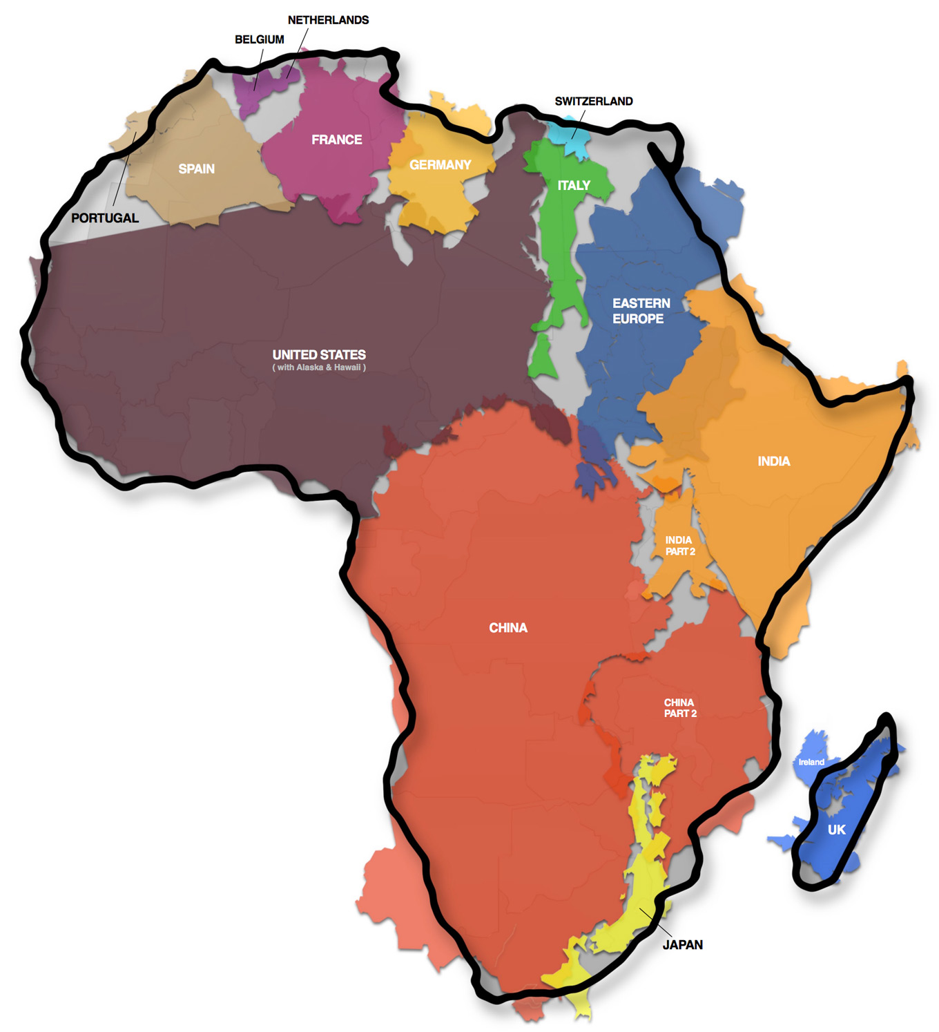
It was a very simple premise that I had seen done a number of times before - never claimed it to be a novel invention - but had a slightly new twist in mind: Africa is so mind-numbingly immense, that it exceeds the common assumptions by just about anyone I ever met: it contains the entirety of the USA, all of China, India, as well as Japan and pretty much all of Europe as well - all combined !
And the idea was to roughly put all of them as puzzle pieces somehow fitting inside the outline shape of Africa, which is of course just a symbolic image - it may as well have been just blobs to tell the story, but it actually worked pretty well with the real pieces, at least enough to get the idea across in a visual and visceral way:
 Download the
original large size
PDF version here
| COUNTRY | AREA x 1000 km2 |
|---|---|
| TOTAL | 30.102 |
| AFRICA | 30.221 |
| Just for reference: Surface of the Moon |
37.930 |
| USA | 9.629 |
| China | 9.573 |
| India | 3.287 |
| Mexico | 1.964 |
| Peru | 1.285 |
| France | 633 |
| Spain | 506 |
| Papua New Guinea | 462 |
| Sweden | 441 |
| Japan | 378 |
| Germany | 357 |
| Norway | 324 |
| Italy | 301 |
| New Zealand | 270 |
| Nepal | 147 |
| Bangladesh | 144 |
| Greece | 132 |
During the making of it, I sent it to a few friends for some feedback, but then next thing I knew Stephen Fry had tweeted it and within literally days there were tens of thousands of reblogs all over the place, a little viral meme…
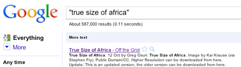
Searching for that exact phrase got over half a million responses in 2010:
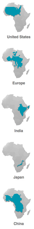
On the right here you can see each of the main 5 swallowed up inside the landmass of Africa, one at a time to make it clearer…
And below that you can see an exact list of another set of countries by area, adding up to less than Africa as well…
The whole point being made was that we all have been taught geography mainly based on the Mercator projection - as the background in daily television news, the cover of my school atlas, in general the ubiquitous depiction of the planet.
But the basic fact is that a three-dimensional sphere being shown as a single two-dimensional flat image will always be subject to a conversion loss: something has to give…
The reason why Mercator was such an important advance is simple: on it one can draw straight lines to account for travel routes - in the days of the gigantic merchant fleets and naval battles an immensely valuable attribute.
But that ability to use lines instead of curves came at a cost: areas near the poles would be greatly exaggerated. Greenland looks deceivingly as if it were the size of all of South America for instance…
In other words: if things are normal near the equator, everything further north and south is familiar to us in a stretched and enlarged version, veering further and further away from the proper size. And conversely: if we kept the shapes as we intuitively know them now, Africa ought to be stretched massively larger to keep it in true proportion.
Hence the fact that in everyday thinking, Africa is just about always hugely underestimated - even by college grads, off by factor of 2 or 3.
The table at right shows the US including Alaska and Hawaii, btw. And while not listing Eastern Europe (dark blue in the map) it adds many others unused in the map: Mexico, Peru, New Guinea, New Zealand, Nepal and Bangladesh!
All of that became the fodder for the old cliché:
“Are you coming to bed, honey?”
“No not yet -there is someone wrong on the internet!”
A veritable shitstorm of responses latched onto the tiniest of tiny details. People complained “you missed Ibiza”, “how could you make Belgium the same color as the Netherlands” “and on and on and on...
Some others were dead certain to have spotted the big flaw “the UK is not the same size as Madagascar - this dude is SOOO wrong!”… and well DUH… that is PRECISELY the point I was making, in action: Madagascar is much larger!
Had I stretched things to truly properly show that though, then the whole shape of Africa would have looked very awkwardly elongated. I chose to tell the basic puzzle piece fitting story by using the familiar shapes.
Both together cannot be done - but one could probably do a much nicer job of an exact list of the ingredients and then a nearly exact fit of the pieces - or maybe “pouring the pixels” highly accurately in proportion into the outline shape of Africa as the vessel to contain them all - but afterwards each country is just a layer of color - I preferred the outlines, even if rather rough and symbolic.
Hopefully someone will improve on it - as mine was by far not the first and should also not be the last attempt to tell the story :)
But many totally missed the single big point: NO - this was not at all an attempt to create “an accurate map”, it was merely a simple graphical depiction of the statement: Africa is just immense - much, much larger than you or I thought. Just look at it, realize that, and smile - because you will never forget it again :)
And: here is to Africa achieving the stature that it deserves to have…